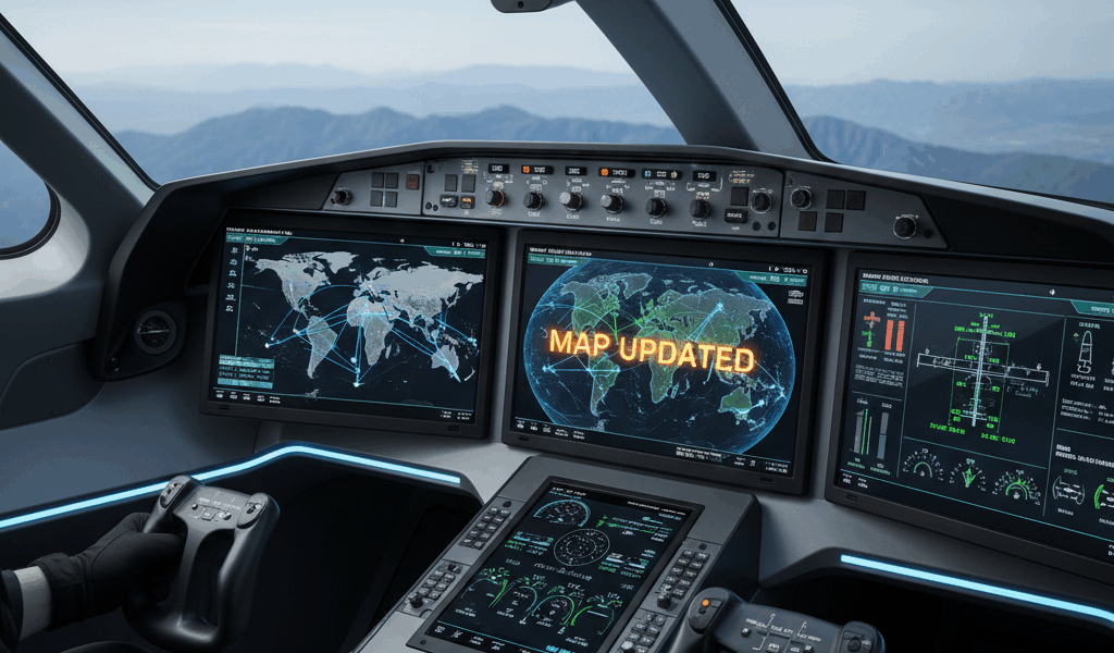
The latest update to the aircraft tracking visualization system introduces a refined map display layer that significantly improves readability and reduces visual clutter. The new design balances information density with clean aesthetics, making it easier to interpret complex airspace situations at a glance.
The previous map implementation suffered from the classic challenge of aviation displays: too much data creates cognitive overload. With hundreds or thousands of aircraft visible simultaneously, the screen could become a chaotic mass of overlapping symbols, tracks, and labels. Finding specific flights or understanding traffic patterns required squinting and careful examination. The redesign addresses these issues through smarter rendering priorities and adaptive detail levels.
The new display layer implements dynamic decluttering based on zoom level and traffic density. At continental scale, only major flights and significant traffic patterns appear, with smaller aircraft aggregated into density overlays. As users zoom in, progressively more detail emerges until individual aircraft symbols, callsigns, and track history become visible at appropriate scales. This progressive disclosure keeps the display clean at all zoom levels.
Aircraft symbology received particular attention. The new icons use color coding to indicate altitude bands, making vertical separation instantly visible. Blues represent high altitude cruise traffic, greens show intermediate altitudes, and yellows indicate aircraft in climb or descent. Aircraft below 5,000 feet appear in red, immediately highlighting low-altitude operations. The color scheme follows established aviation conventions and remains readable under various lighting conditions.
Label positioning now uses sophisticated algorithms to minimize overlap while maintaining clear associations between labels and their corresponding aircraft. The system calculates optimal label placement considering aircraft velocity vectors, nearby traffic, and geographic features. Labels automatically adjust their positions as aircraft move, maintaining readability without requiring manual intervention.
Background map styling shifted toward lower contrast and muted colors, allowing the aircraft data to stand out more prominently. Unnecessary geographic detail was removed while key features like airports, navigation aids, and airspace boundaries remain clearly marked. The new base map strikes the right balance between context and focus.
Performance optimization accompanied the visual improvements. The new rendering engine uses hardware acceleration and efficient data structures to maintain smooth 60fps updates even with thousands of aircraft visible. Mobile devices benefit particularly from these optimizations, making the tracking system practical on smartphones and tablets.


Stay in the loop
Get the latest aerodata updates delivered to your inbox.